Birds of Paradise

I once had an idea for a comic strip, called "Birds of Paradise." It was about a bunch of birds living on an island, free from mankind but with all the trappings of modern society, such as telephones, ipods and toasters. It was a very good concept but the type of humor it would require didn't mesh with the kind I'm most skilled at writing. I didn't want to feel like I was pulling punches in order to preserve the overall benign nature of my subject material, so I never submitted it for publication.
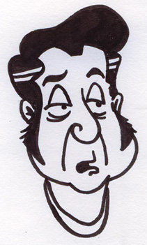
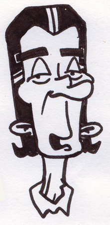
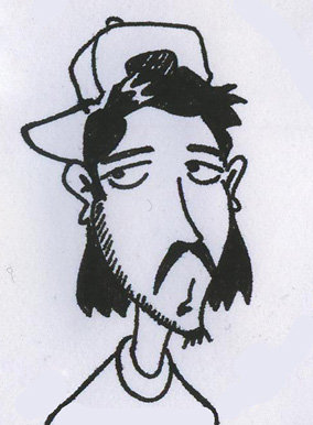
This is Cecil, the peacock, being his usual surly self.
I had created a female bird to interact with the mostly male cast but was never completely satisfied with her personality. My ex-girlfriend suggested that I create a character that was, in her words "sluttier." Genevieve, the flamingo, here, was the result. My feelings about her were mixed: I loved her appearance and felt she'd mesh well in the cartoon. At the same time, I felt a bit dirty inside for caving in to someone else's idea instead of finding the solution on my own.
Later in the strip's development, I felt as though I needed one more character to bring the roster up to six. Six felt right to me. I had an antagonist, a pessimist, the requisite female, a nerd and an idiot. I needed an artist-type to express the virtues of self-expression, vanity and capitalist greed. Hence, Mondo was born. I have no idea what kind of bird he is. I just enjoyed the idea of having a character who was prone to babbling philosophy and a bit of shameless shyster-ism. I forced him to wear a beret because you just can't assume that readers will recognize him as the artsy one without some kind of visual cue. I hate dumbing things down like that.
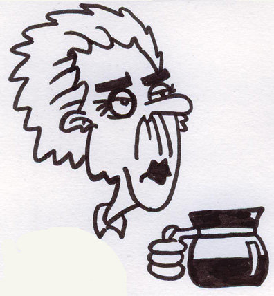
This one was my favorite, only because I envisioned him as being the closest to my own personality. Remo the toucan was sarcastic, a bit of a procrastinator, and oddly, a hopeless romantic (thereby introducing sexual tension into the comic). He wasn't designed to be inherently evil but as time went by, and I drew him in more poses, it became clear that Remo was definitely a bit of a jerk. I was happy with that character progression since he was originally intended to be the central protagonist and these things always work out best when the protagonist is highly flawed.
As a side note, along the way I became aware that designing cartoon characters wasn't so much a matter of sitting down and creating the kind of character you want, but instead coming up with a random design and being "introduced" to the character for the first time. To me it's like my characters had always existed and we'd only just crossed paths, allowing the opportunity to get to know each other. Remo was always a jerk but I had no way of knowing this until he was drawn. I hope this makes sense.
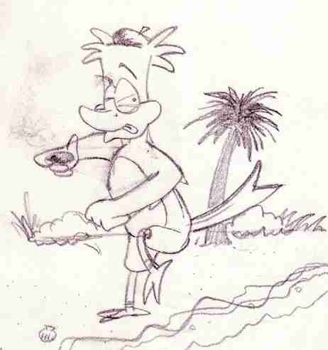
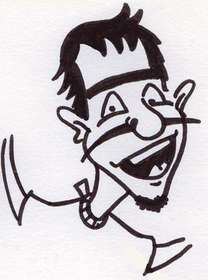
Another picture of Mondo, this time attempting to skip a rock. I want to point out the palm tree in the background here. At some point, I realized that if the birds' island was to be tropical, I'd damned well better know how to draw a palm tree. I must've fussed with sketches for three months before I came up with a palm tree style that I could accept as being visually compelling while still being instantly recognizable. I suspect that I am something of a perfectionist; nobody else would fret so long over such trivial details.
Many of the good comic strips out there have one character who, by their own blend of charm and basic humanity, become the heart and soul of the strip, even if they weren't originally meant to be the central character. Examples: Snoopy, Opus the penguin, Jason Fox (Foxtrot)
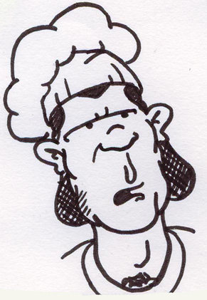
For me, Lemon the dodo slowly became the portrait of naivetee and blissful ignorance whose presence softened the sharp edges of all the other characters. Being the last of his kind never really fazed him in my mind. As far as Lemon was concerned, all the other dodos had gone for a long walk.
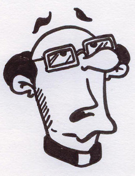
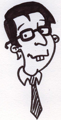
When I first conceived the idea for Birds of Paradise, I knew I'd need a nerd. If I ever wanted to mock technology, the joke would have to come from a perspective familiar with scientific junk. Nerds are also good sources of self-scathing humor and the occasional bit of bumbling idiot-savance. Traditionally, no member of the avian kingdom is geekier than an owl, so I knew that would click with anyone reading my work.
I originally wanted him to be named Cosmo since it was both a brainy name and a subtle reference to outer space. I then learned that the main character in the comic strip "Shoe" was already named Cosmo. Plus, he is a bird. Damn. I knew someone would accuse me of ripping that off, so I eventually changed this character's name to Jules. It's still sufficiently nerdy and bears scientific subtext, so it works for all intents and purposes. But deep down, to me, he'll always be Cosmo.
Headshots
I like to do headshots. When I set out to draw one, I never know what to expect. That is, I rarely have a concrete plan in mind. I just set pen to paper and see what happens. If I like what I see, I keep the scrap of paper and shove it into a binder of all my successful sketch work.
If I like a particular headshot enough, I'll assign it a name in my mind so that I can instantly recall their basic appearance and draw it again.
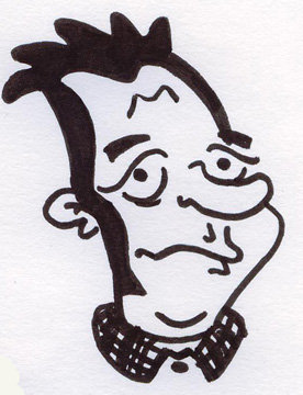
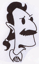
This one is "Bradley Roach." He definitely looks like a Bradley, and sufficiently shifty enough to have "Roach" as a last name. I've noticed that I'm pretty good at drawing sycophantic types. I have no clue why this is.
The muttonchops totally sell this. I don't think I'd be nearly as enamored with his appearance were it not for the flaring sideburns.
I once thought it'd be a good concept for a comic strip to base it off an entire small town instead of a single character or family. To pull that off, I'd need roughly 25 reusable characters whose appearances quickly defined a lot of their personalty. This guy seemed like the typical sort who'd be found leaning over the counter at the local greasy spoon. In other words, he was ideal. I named him "Conrad Shoefly" and set him aside.
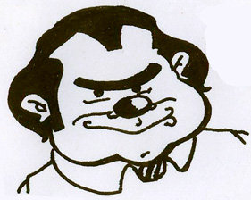
This one totally surprised me because I was not expecting anything so interesting to look at. I think it's the cro-magnon brow that defines this guy. I've tried to draw him over and over again the same way but haven't been able to pull it off. It's tough to make him look oafish without making him also appear stupid. I named him "Bill Grubb."
This one was an intentional attempt to draw a typical Irish priest. I don't usually go in with a plan and hit success on the first try - or the second, third, fourth or fifth. This was a rarity where my initial impression was dead-on. I don't often give my characters shortened foreheads because it usually looks bizarre to me. Somehow it works here. I named him "Father Brimstone." It's not the most revolutionary name but it succinctly captures how I see most clergymen, so it kind of stuck.
This amuses me to no end, mostly because I've worked with similar people. The expression on her face perfectly captures her narrow range of emotions, from indifference to deep loathing. From the moment I designed her, I knew she was worth keeping. Even her name, "Georgia Burlap" seems perfect.
This guy has always seemed very unusual to me. Not sure why. Maybe it's like the perfect storm of bizarre physical traits that makes him work overall. The low-set ears, the high cheekbones, the bumpy nose, sleepy eyes. I think he looks vaguely Native American without being an offensive caricature. I call him "Elmer Nutchell."
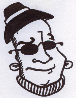
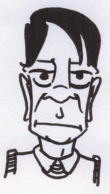
For a brief time, I considered a cartoon about a cable news network. Seemed relevant and universal enough. But I eventually nixed the idea because it would probably require that I stay current with politics and current events, whereas in many cases, I just don't care. Of the numerous characters I designed for that concept, I liked this guy best. He struck me as a complete egotist, the kind who makes a gigantic deal out of having won a local Emmy seven years ago. He was named "Harvey Marble," a name I still think is pretty nifty.
I admit, I'm not great at drawing ethnicities other than white folk. They say to draw what you know, right? Somehow, this one came out prettty good, if not being a tad overstereotypical. But he seems benign and jovial enough that I doubt anyone would care. I call this guy "Hong Dynasty." Maybe that's a bit too racist? I dunno.
Not sure why I decided this one was worth saving. He doesn't seem particularly bright, or even interesting as an individual. I suspect that I really like his goofy hair and sloping brow. It captures the essence of redneck cluelessness well enough, even though I don't believe that was what I was going for. His hair looks like a chicken's comb, and I somehow find that very entertaining. I think I named him "Huey Galoot."
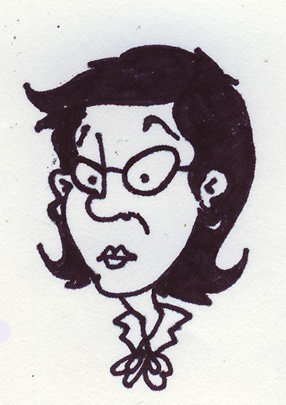
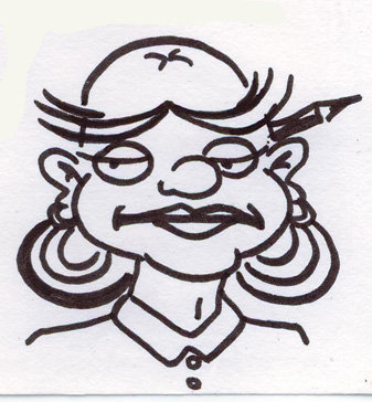
I confess that I'm not exactly a master at drawing women's hairstyles. Most of the time, they come out looking similar to this. It's a workable design but when I draw several females, the lack of variety begins to show. I remember purposely trying to draw a librarian for reasons I've since forgotten. To that end, this came out pretty well. They always have those glasses, it seems. Not pictured is the speech balloon I put in above her which read: "Dewey Decimal? Do we ever!" Yeah, that's pretty horrible. I never came up with a name for her, unfortunately. Looking at her now, she seems like an "Esther Lemongrass" to me.
Half the time, when drawing headshots, I'll like something I created but will have no immediate use for it. That's when I stuff the sketch into a folder so that it's not lost to eternity. In this case, I wound up fooling around with a concept about a fast food restaurant. Out of all my ideas, it actually had the most potential, and if I were to make a serious attempt at syndication now, it's the idea I'd go with. While tinkering with the concept, I needed an assistant manager whose appearance suggested burnout. Going back through my folder, she seemed the most ideal. I never settled upon a name for her, however. Even at this moment, nothing definite springs to mind. She seems like a "Bernadette" but beyond that, I'm stumped.
You know that green saxophone player from The Muppet Show? If he was more human, he'd probably look a lot like this. In my mind, this character is black but it's not so easy to depict that without getting into the pantone shading, and that's pretty much impossible when sketching on paper. My solution is usually to add a bit of hatching on one side to suggest darkness without coloring the whole thing in and thereby reducing it to a racial portrait from the 1920s. I find the lack of a neck on this guy rather endearing to the character. I called him "Byron Wedgehorn," probably as a suggestion that he plays a brass instrument of some kind.
When I drew this one, I laughed for a good ten minutes. When that happens, I know I've unlocked something completely exploitable. I had it in my mind that it'd be interesting to draw a sleazy lawyer. While he doesn't appear entirely crooked, there's still something unsavory about him that I cannot put my finger upon, and that compels me. Though his upper lip definitely mimics the Simpsons, I like him enough not to care about calls of style plagiarism. He eventually became the more reputable, and dumber, half of a sleazy lawyer duo. In a moment of ludicrous inspiration, I named him "Lyle Learnbucket" and am still in love with that monicker.
I just want to say that I quite loathe drawing baseball hats because they ALWAYS appear wrong to me. It's a shame that, as an accessory, they're often quite revealing of character. This here is one of my few successful attempts at drawing a Latino. So naturally I gave him the worst name possible: "Manuel Layburr." It's a horrible, insensitive pun and I should probably be dragged into the streets and whipped by wild horses for it.
Every now and then, I'll come up with something I personally enjoy but would never, ever use on a professional level. There's nothing wrong with this character, per se, but he just seems too distorted in comparison to my usual style. Nevertheless, I find the shape of his head interesting, especially the way his forehead merges with his rather prominent nose. He's forever been nicknamed "Senor Grumpy" because I'm pretty certain I'll never need to come up with a better title.
I usually approach headshots from a 3/4 angle. It's not exactly a conscious decision, it's just how I best perceive people. This one came out at a full frontal angle and I was pleasantly surprised. I'm a fan of campy horror comedy, especially of The Addams Family and The Munsters. This one really reminds me of Lurch, but in a far less monstrous way. He's creepy and even slightly deformed, but he doesn't seem overtly sinister. I'm also noticing now that he has Adolf Hitler hair, which probably adds to the unsettling nature. For the curious, his name is "Benjamin Erksom."
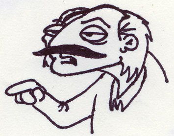
Remember Lyle, the moronic lawyer? This is his partner in condoned crime, "Leroy Lumphouse." I don't often give my drawings beady little dots for eyes but it felt appropriate here. His nose suggests some alcoholism going on, and though it was a spur of the moment decision to add that, I felt it really helped to define how I viewed the character. He's dishonest, manipulative and contently amoral - like any successful lawyer, really. He was supposed to be in cahoots with a crooked mayoral character named "Jonas Lupohl" but I lost the designs somewhere and was never able to successfully reproduce that one to my satisfaction. Oh well.
Nothing terribly insightful to say here, other than I find geeks pretty simple and fun to draw. They're so universal. Because I rarely decide ahead of time what I'll sketch out, a lot of my doodles wind up being geeks like this. They all look roughly the same: thick-rimmed spectacles, bad hair, big noses, mismanaged teeth, office casual wear. For that reason, I rarely assign them name since they're so dime-a-dozen to me. If I had to give this one a name, it'd probably be along the lines of "Toby Spore" or something equally guaranteed to prevent success with the opposite sex.
Ever read about some nimrod who managed to get himself pinned underneath a tractor that he was operating? This is that guy. He's a total moron but somehow manages to make it his most endearing quality. This guy I just called "Varmint" because, well, look at him. The unibrow is a powerful device.
Sometimes I reverse the process. I come up with a name, and then see if I can make something to match. It doesn't always work out but this one did. I don't remember what the controlling reason was, but I wanted a character named "Petey Cruiser." The only requisite was that he had to be young, and perhaps a little headstrong. There's nothing outstanding about this particular design but it's general enough to be a main character. The eccentric ones are best used as support, I think, mostly because they're more one-dimensional. For the record, I intended this guy to have a friend named "Deuce Cooper" but never got around to drawing him.
This is another one that came out resembling a waitress. So I added a pencil behind her ear and clinched the deal. I still like the older, surlier waitress I drew better, but I suppose it's good to have backup designs in case something doesn't work out. I'm not sure what's going on with the base of her hair. It's as if she has a couple cinnamon rolls happening there, like some middle-aged Princess Leia. I am a fan of the name I gave her, though: "Josie Gorgonzola." Food names amuse me greatly.
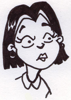
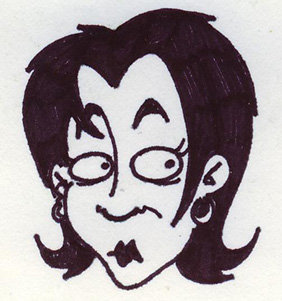
Some designs just have that "main character" feel right out of the gate. After coming up with this one, I must've drawn her five-hundred times until I could do it with my eyes closed. She's quasi-Asian but not blatantly enough to make her a crude stereotype. I admit that I don't know squat about being Asian in America but that never felt like an actual limitation when considering her potential. To me, she looked intelligent, slightly sarcastic and just bitchy enough to be interesting. Her name is "Ming Dynasty" (granddaughter to "Hong Dynasty"). I never fully developed a world around her but I still think "Ming Dynasty" is a hell of a name for a comic strip.